
We help businesses build brands and digital Experiences that connect, convert, and scale.
Get Started
Three projects. No filler


Authentic Man is an umbrella brand built around three pillars of personal development: physical fitness, performance nutrition, and continuous growth. Rather than treating each offering as a separate business, the goal was to create a cohesive brand system that could scale while maintaining a consistent experience across every customer touchpoint. The result is a unified identity that supports multiple products, services, and communities under a single vision.
Health & Fitness
Brand Designer & Creative Director
The challenge wasn't simply to design a logo—it was to organize a growing ecosystem into something clear, scalable, and easy to navigate. Each sub-brand needed its own purpose and personality while remaining unmistakably part of Authentic Man. The identity had to communicate strength and discipline without relying on clichés, while giving the business a flexible foundation for future growth.
My process began with the business rather than the visuals. I mapped the relationship between the parent brand and its sub-brands, defined their roles, and established a consistent visual language before designing individual assets. Every decision—from typography and color to layouts and messaging—was guided by clarity, consistency, and long-term scalability. The goal wasn't simply to make the brand look better, but to build a system that could grow with the business while remaining recognizable and easy to maintain.
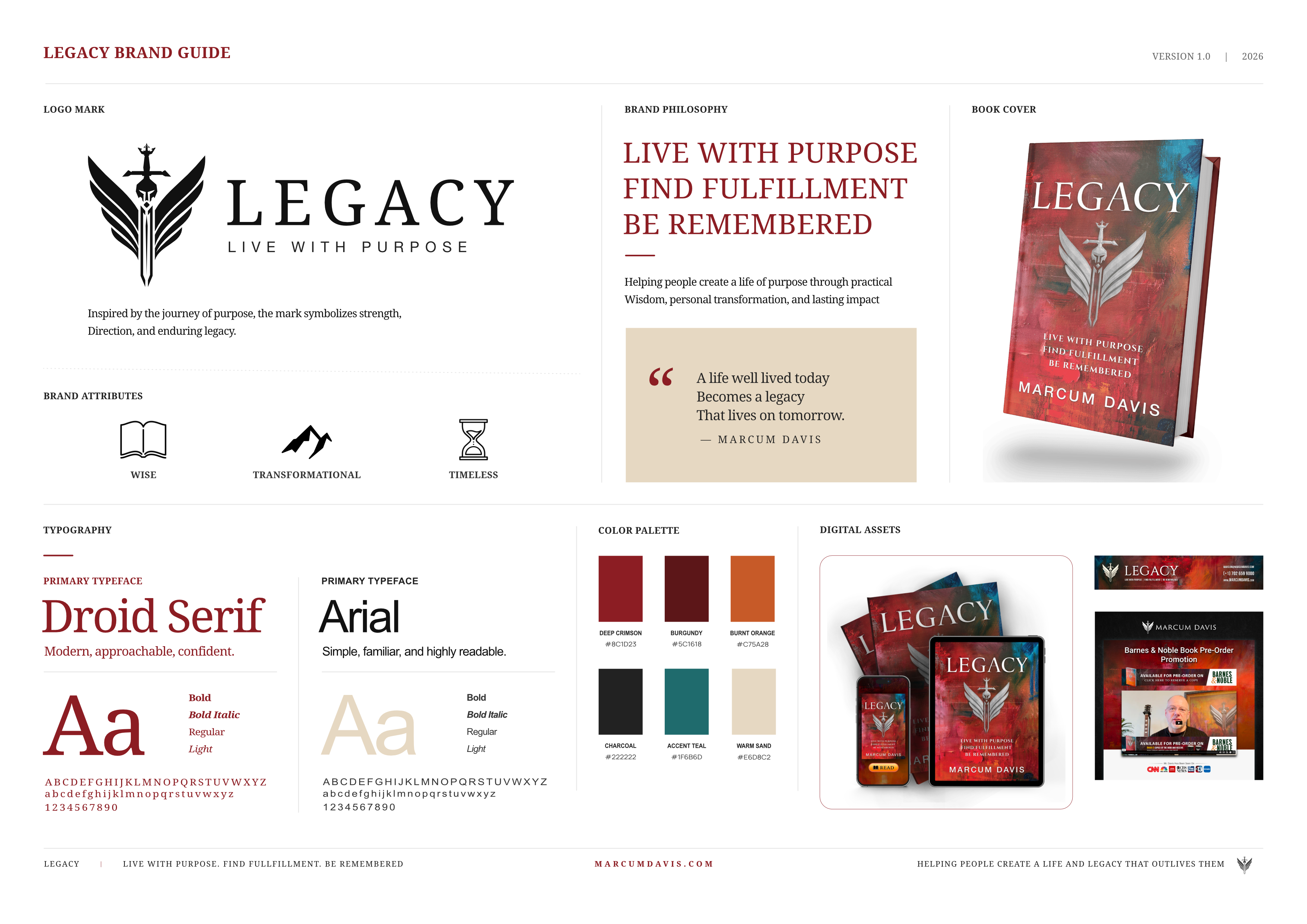
Legacy was created as a premium brand to support the launch of a flagship publication while establishing a foundation for long-term growth. Rather than positioning the book as a standalone product, the brand was designed to evolve into a broader platform for education, digital products, and community.
Personal Development
Brand Designer
The identity needed to build credibility before launch, generate anticipation through lead generation and promotional campaigns, and create a cohesive experience that could scale well beyond the initial release.
The project was approached as a complete brand system rather than a book campaign. A cohesive visual identity, editorial direction, and digital experience were developed to support the launch while providing a flexible framework for future products, memberships, and content.
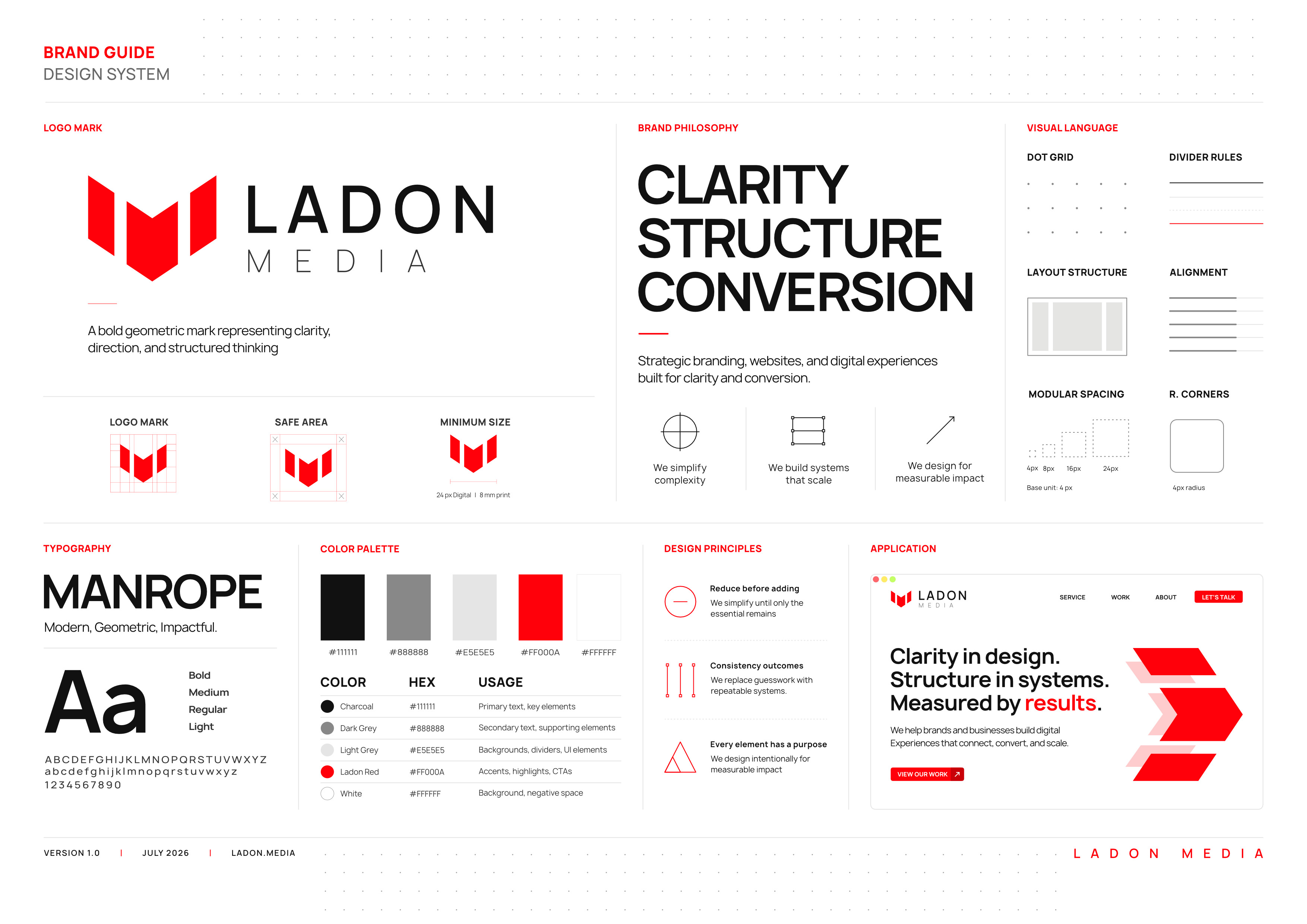
Ladon Media is a branding and digital design studio built on a simple principle: effective design removes friction. The identity was created to communicate clarity, confidence, and decisive execution while providing a scalable system that supports brands across web, marketing, and digital experiences.
Creative Services /
Branding & Digital Design
Brand Designer
Ladon Media needed an identity that could stand out in a crowded design industry without relying on visual excess. The system also had to support fast, consistent execution across the website, presentations, social media, proposals, and client deliverables.
Rather than designing a logo alone, the project focused on creating a complete design system guided by three principles:
Attention. Clarity. Impact.
A distinctive red establishes immediate recognition, while restrained layouts, generous spacing, and disciplined typography reduce cognitive load and create a clear visual hierarchy. Every element—from color and spacing to typography and composition—was designed to work together as a reusable system instead of isolated assets.
The result is a framework that enables faster execution, consistent communication, and scalable brand experiences across every touchpoint.

Ladon Media was built on a simple belief: good design should make businesses easier to understand.
Every decision—from brand identity and websites to digital systems—is made with clarity in mind. Not to add more, but to remove what doesn't help. The result is work that feels intentional, communicates confidently, and gives people a clear next step.
Design isn't decoration. It's how a business introduces itself, earns trust, and grows.